Building the Whimsical text editor: part 1
At the start of 2020, we began building a brand new text editor. Looking toward the release of docs later that year, we wanted to ensure we could create the best possible writing experience.
At the time, we were relying on a Slate (a third-party text editing library) to handle text editing in boards. While this was mostly working for us, upgrades were a pain and we had many unresolved issues with extended language support. With the new text editing requirements in docs, we realized this library was ill-suited for our long-term plan. This combination of product aspirations and technical concerns led us to start anew.
Building a text editor within a browser came with many challenges. It wasn’t easy. It still isn’t easy. This has been our longest running technical project at Whimsical, which is why this article has a Part 1 and a Part 2.
Let’s start with Part 1.
What it takes to start from scratch
‘Scratch’ is a loaded term with any browser-based tool, but building a new text editor is still a massive task. It’s not something I ever thought I would do...and it was somewhat terrifying.
The browser gives you a lot for free, but it comes at a cost. Your app lives within multiple platforms with existing opinions about text input. Many factors are completely out of your control and are simply different between major browsers and operating systems.
Still, we knew that we wanted deep control over many fundamental text editing features. That meant recreating them for ourselves.
We had to reinvent and rediscover numerous text editing capabilities, which required careful consideration about how text editing should work in a product like Whimsical.
Here’s a closer look at some of those considerations:
Selecting and navigating text
How should text selection and cursor placement work?
This is such a fundamental part of modern applications that we often don’t even think about it. It’s an expectation, not a feature. Still, editing collaboratively often gets less consideration. How should another user’s typing experience influence your own? There are a few things that we believe are important.
Typing at another user’s position shouldn’t move their cursor
When this happens, it can be maddening—like when a laggy video game finally catches up and you discover you are in a completely new place. A user’s cursor is a crucial communication tool. Often it is the only way in which editors communicate while working on a document.
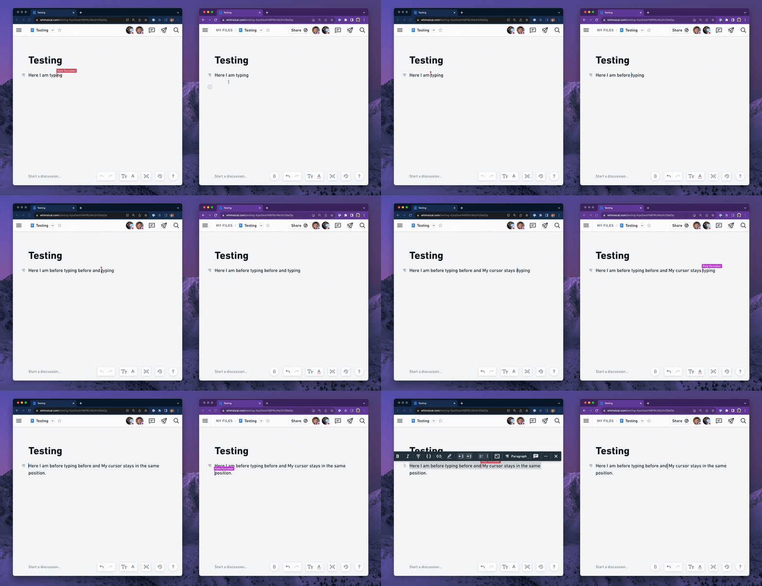
When one user types at the same location as another user, all of their edits should be respected and inserted where they intended. The cursor should definitely never get pushed along with the other user’s edits or jump to the wrong spot.
As a typist, you need to feel in control.
Keeping the cursor in the correct position no matter what
The browser gives us tools for managing selection and, at first glance, we could use existing DOM APIs to model selection. However, since a user essentially performs arbitrary HTML manipulation while they type, there are a lot of cases where DOM selection struggles to keep up.
Let’s look at an example:

Here we have some text inside of HTML. In the browser, a selection range is based on an HTML element, with a relative numeric offset indicating the position of the cursor within that element.
Another way to describe the example above is with a browser DOM Range:

4 characters from the start of the span. Easy enough. But what happens if some of the text is made bold by another user?

This bold section counts as a position relative to the span, so if we use the same selection position, the cursor will jump over to the right!

The solution we developed to this problem is to describe selection at a much higher level of abstraction that transcends the rendered HTML output from our editor. This way, we have a format that can account for these modifications.
Cursor position is more of an idea than a place
In our data model, every atomic unit of content is expressed in a chain. Each node has a distinct index that does not change between edits:
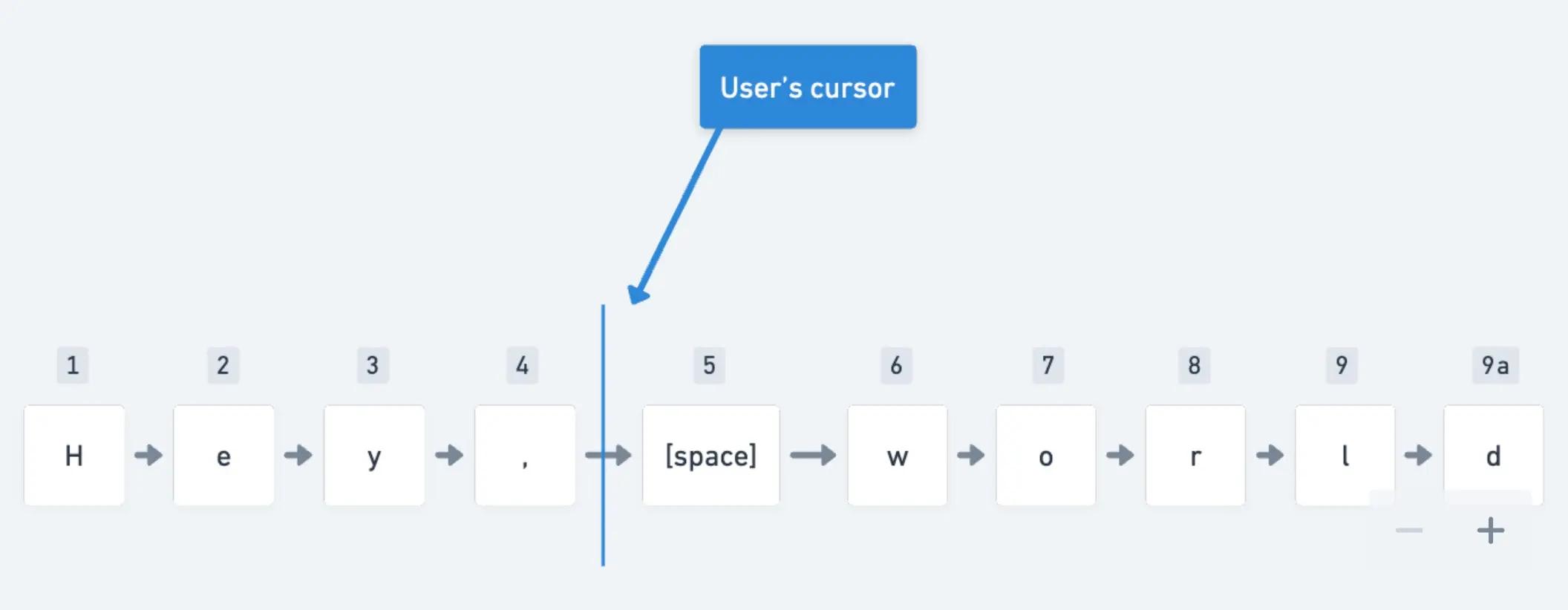
Our selection model
This means that if content is changed in any way—formatted, deleted, updated—the cursor’s position remains associated with the underlying content. The structural change doesn’t matter because the index stays the same.

New edits
This has an additional benefit: if the index of the cursor is ever deleted, we can still place the cursor as close as possible to the original location.
This ends up paying off not only for a user’s selection state, but also when visualizing the location of another user’s cursor and selection. The increased resilience to change ensures that multiplayer text selection remains correct as a document is modified.
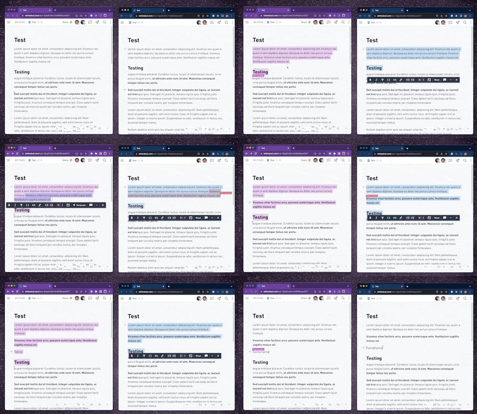
Text formatting: always respect a user’s intent
Our guiding principle in collaborative text editing is to always preserve the user’s intent—their desire whenever first performing an action, regardless of activity from other users. This is especially important when applying formatting, where user actions can conflict.
What happens when one user removes the bold formatting below, while another makes the entire sentence bold?
Let’s use the following example to support my point:
This is really cool text.
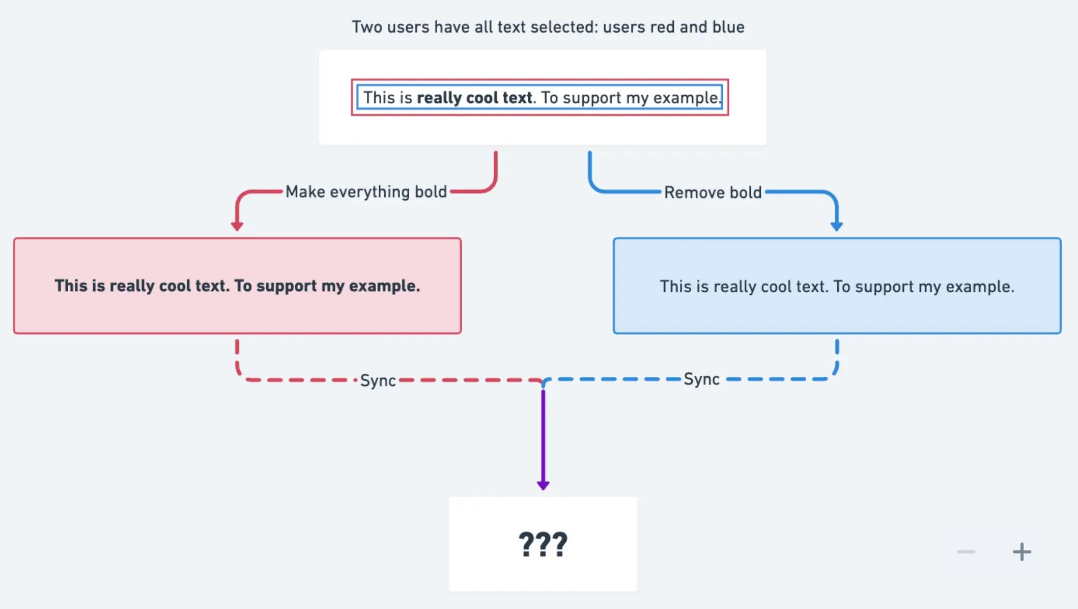
Text formatting example
The question is somewhat philosophical, and there are a lot of cases to account for. Ultimately, someone’s change is going to win. This text will be bold or not, but how do we decide?
Here’s the solution we arrived at:
Give every formatting range a unique identifier
When adding bold, always create a new range with a new identity. Never modify the data for an existing range.
When removing bold, create a new range that says ”don’t apply this formatting.” We call this anti-formatting.
In using this technique, we can always communicate intent of an action across multiple users, resulting in a predictable outcome:
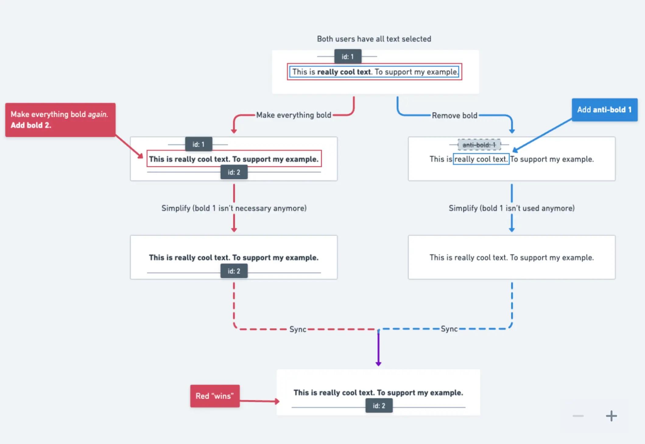
Resolving conflicts
This is a sort of tomb-stoning. We developed this approach as a way to communicate removals across clients within our sync model. This is done such that any client can safely clean up stale formatting. It also allowed us to avoid the perils of operational transformation, which was a major boon for our small team.
Building our own text editor has been no small feat. Nearly four years in, and we’re still continuing to evolve it today. In my follow-up article, Building the Whimsical text editor: part 2, I’ll share some of the ways we’re continuing to evolve the writing experience in Whimsical and some of my favorite characteristics of our editor that I believe bring users delight.
If you haven’t experienced writing in Whimsical, try us out for free today.

