Building the Whimsical text editor: part 2
Building a text editor within a browser is no small feat. In my last article, Building the Whimsical text editor: part 1, I shared details about how our editor works and key considerations that make text editing in Whimsical feel whimsical.
A text editor is one of those projects that’s never quite finished—it requires continuous tinkering and evolution. In this article, I’ll dive into one of our latest text editor updates and share some of my favorite details about our text editing experience.
The latest — building for international language support
We want our writing experience to work for every user and every device.
As a highly distributed international team with customers worldwide, it’s important that our editor works properly in everyone’s native language.
Support for multiple types of input is table-stakes for any text editor, but it was really lacking in the earlier version. User input methods were very easy to break, and the results were incredibly frustrating.

The macOS diacritics menu appears when long pressing vowels.
The macOS diacritics menu appears when long pressing vowels.
For example, many users input content through an input method editor (IME), which allows them to write in their native language using Latin characters. Often this is paired with a candidate window to provide replacements as the user types:

The menu in the window above can’t get into a bad state while a user is trying to figure out how to express themselves. This stuff just needs to work.
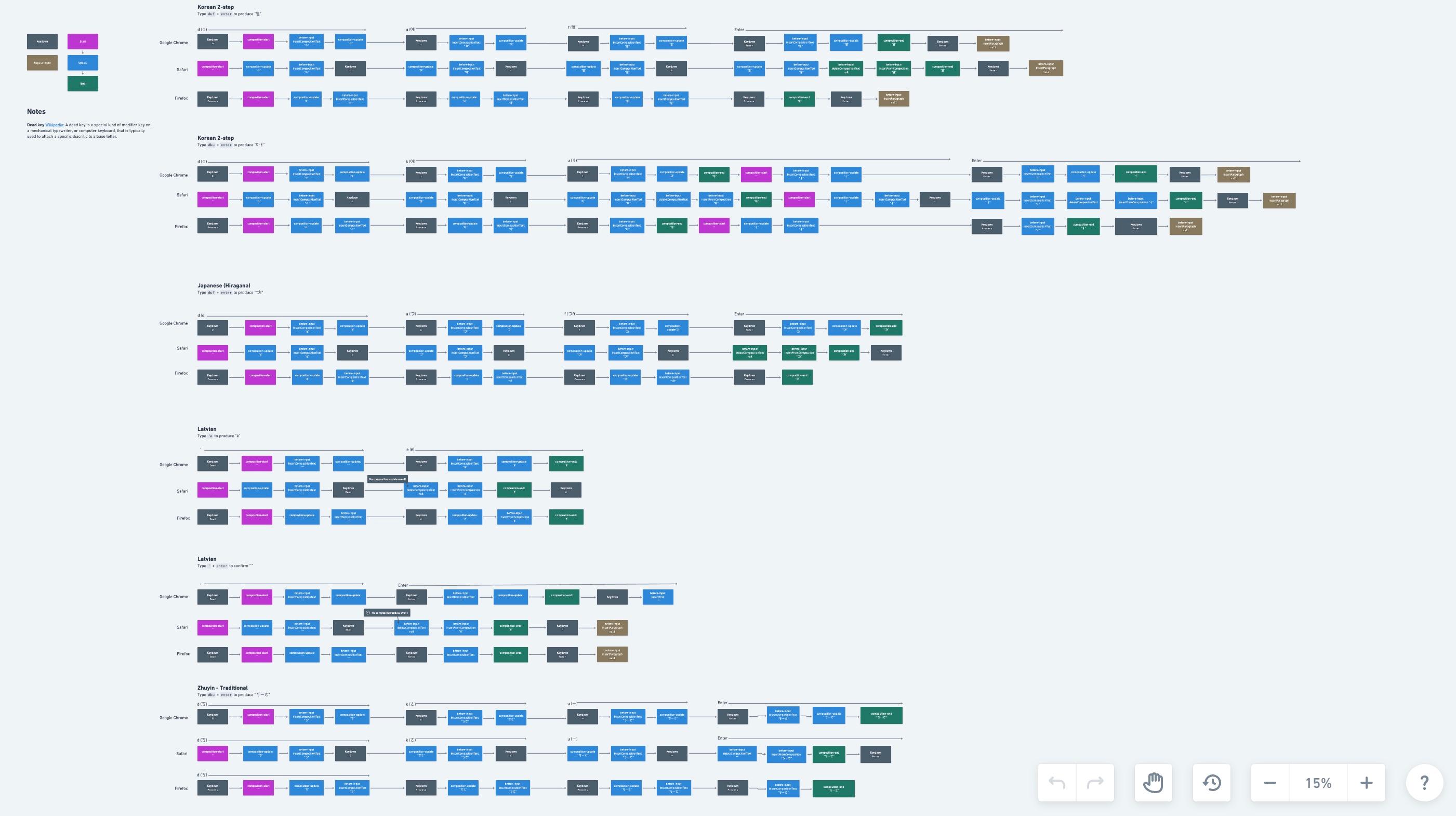
As we’ve made improvements to the editor, maintaining international language support has been a major challenge. The tricky part is that it requires an incredible amount of care to maintain good support for IME engines and OS-level input methods like auto-complete and auto-correct. These behaviors vary by browser, input language, and device. It’s wildly complex. For example, here’s a flowchart that we developed to understand the differences between browsers on macOS:
Despite the complexity of this project, it’s been very rewarding to see our text editor in use across so many different languages. Our extended language support is an ongoing effort, but we’re seeing the benefits in all sorts of unexpected ways. One area has been mobile support. Our mobile text editing support has improved greatly alongside improvements to text composition:
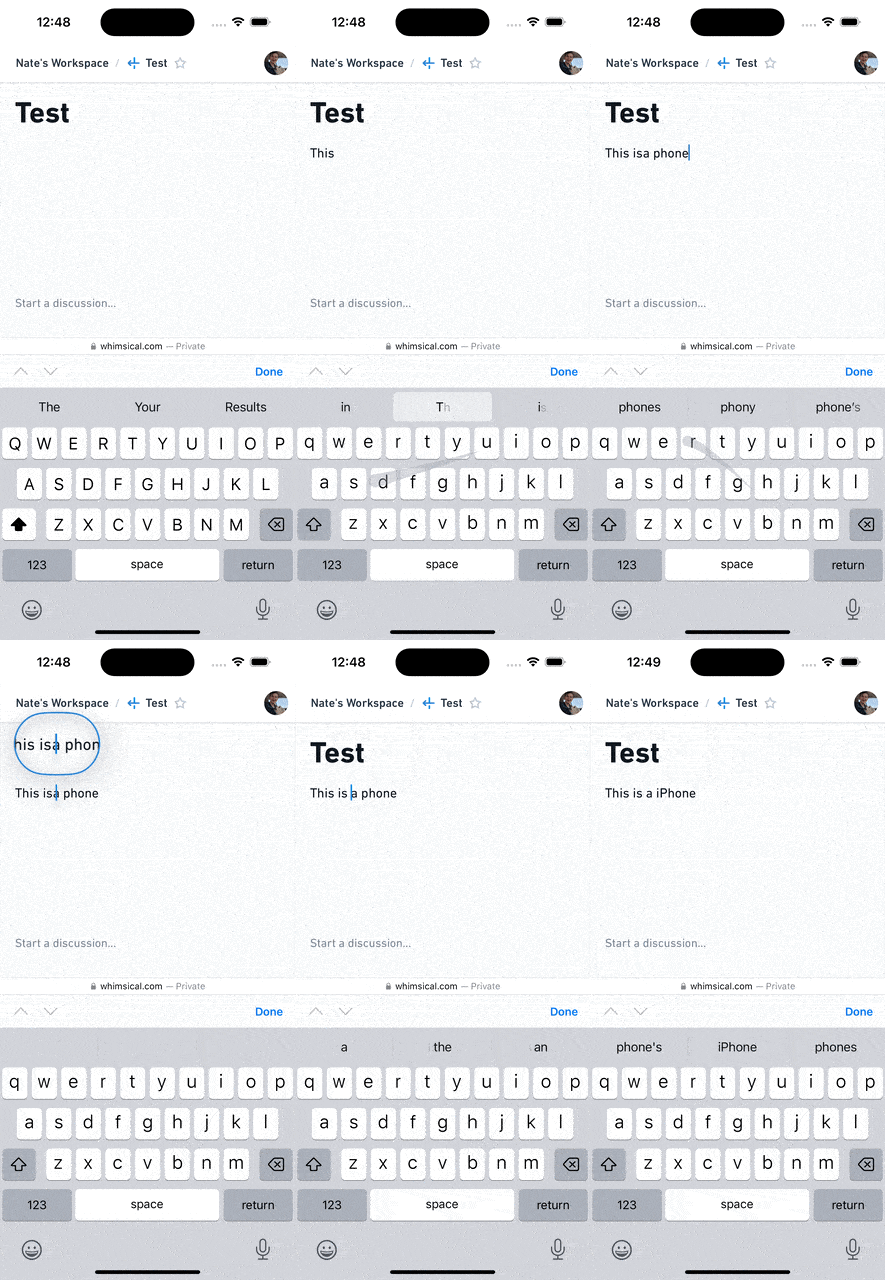
Mobile input and composition support are linked in a lot of ways. Doing so takes time, care, and hard work, but the end result is something that we’re quite proud of.
Taking a moment to reflect on it all
Was it worth it? Yes. Our need for a first-rate text editor has only expanded over time. As we’ve introduced rich-text formatting to our boards and expanded our text editing features, having the ability to rework core parts of the editor has been immeasurably helpful.
We can have the same text editing experience across boards, docs, and anything new that we build in the future.
Creating a fast, familiar writing experience in Whimsical dives deeper into the details of this experience, but here are a few examples that I think are particularly fun:
Visual changes to the cursor when formatting text
Our editor has a completely synthetic cursor, meaning that (in most cases) the cursor presented to a user isn’t the native cursor provided by the browser.
While we maintain native selection under the hood, the custom presentation allows us many affordances, such as hinting when formatting has changed:

Movement along inline code formatting boundaries
Figuring out when your cursor is inside or out of code formatting was a real friction point for us, so we made it easy to escape inline code segments, providing a visual cue with our cursor:

Nesting boards and other docs
We allow users to embed all sorts of content in our docs, but embedding Whimsical files is special.
Since embedding Whimsical files into a doc doesn’t create an iframe, the content loads super fast, and we can use the existing resources to improve the time it takes to open a doc.
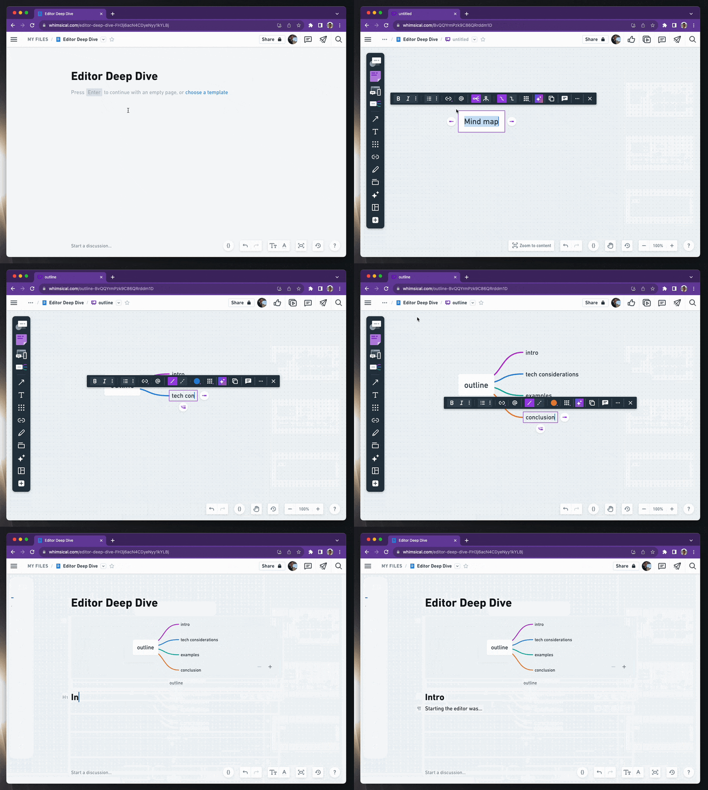
But beyond load times, it’s also super quick to embed a file at any time. For example, just type /board to quickly create a new board and embed it in your document:
Building a text editor is a huge effort
Creating our text editor has been arduous, complex, and rewarding. We learn and discover new problems, and the editor changes as a result. Like our input collection process, which has changed dramatically from its first implementation. And now that we've extended our support for mobile devices, it's forced us to question core assumptions about how our editor needs to work.
It’s demanding work, but building something for ourselves also means we get to chart our own course. We can build whatever we need and work towards the best possible user experience.
If you haven’t experienced writing and text editing in Whimsical, try us out for free. Share your feedback with us on Twitter.

