Why you shouldn't design wireframes in sketch
Focus on your ideas, not on pixels.
1 min read · June 14, 2018
1 min read
Jun 14, 2018
1 min read · June 14, 2018
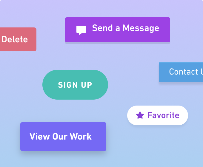
Let’s say you start wireframing and need to add a button…
How tall should it be? How wide?
What color?
Dropshadow or no?
Squared corners? Rounded corners? Pill shape?
How much padding should I include on the sides?
Wait, is the text totally centered?
Should I pick a different font?
Maybe I should use medium weight?
This button needs an icon…
Create my own? Hmm, hearts are actually harder than they look.
Look for a library? What was the name of that cool one?
What does the Material icon set do? Noun Project?
Download complete – now bringing it into Sketch.
…
Or, you could just create a button in Whimsical:
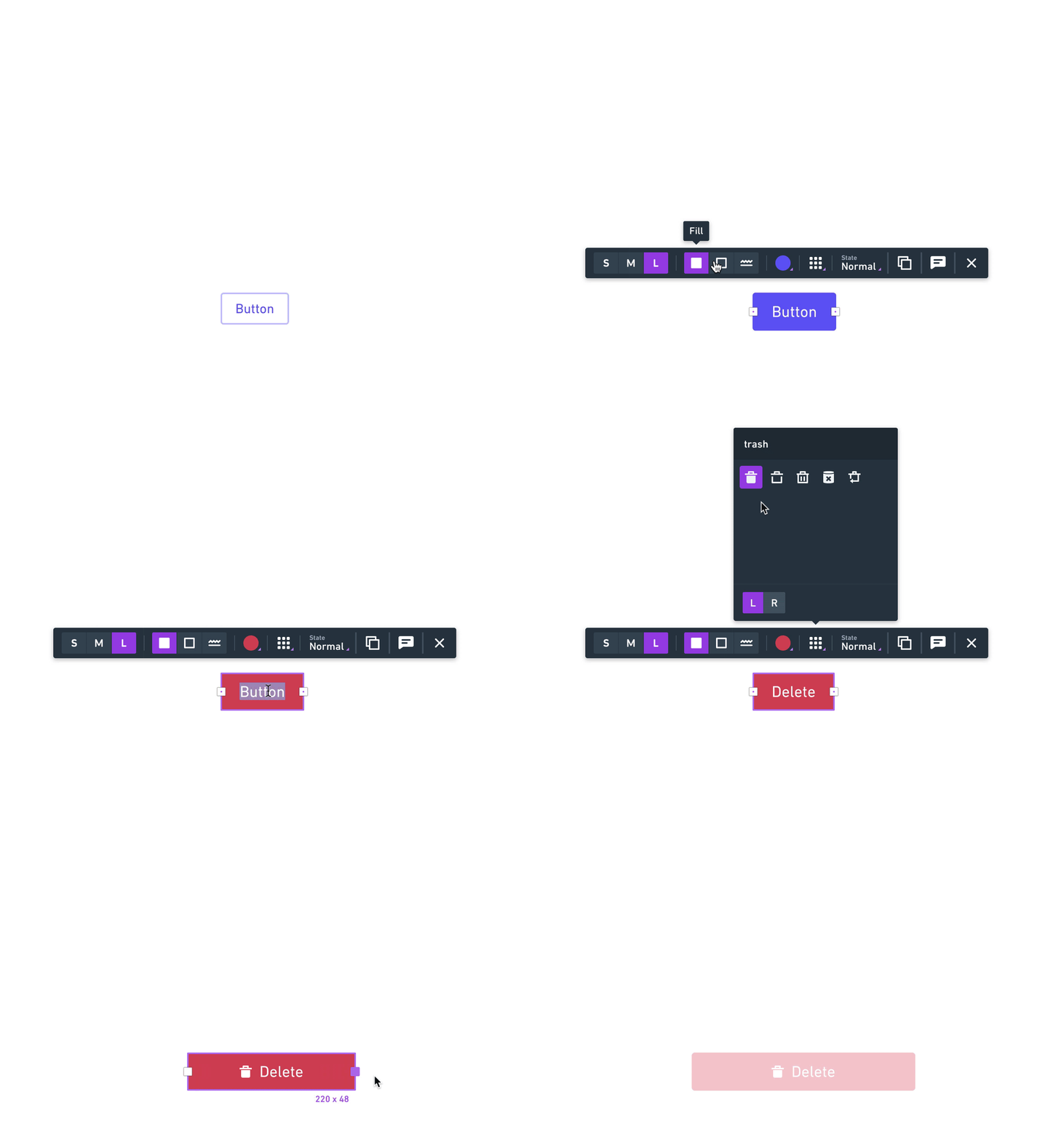
Read more about how we designed Whimsical Wireframes – blazing fast wireframes with real-time collaboration.

