Design details that help our users move faster

We care a lot about speed, as do our customers. Ideas come fast, often unstructured, and can send you down tangents. As a tool for expression, Whimsical must match your speed of thought and ideally accelerate it.
Speed is a common topic in engineering, where page load and API response times are monitored and optimized. For product folks, speed can also be “designed in” by understanding the user’s job and making smart decisions on their behalf.
Individually, these optimizations might not amount to much: a click saved here, a smarter default there. Collectively, however, these small tweaks compound across the product. This quality is often hard to pinpoint or describe, but it just feels better.
In this article, I’d like to highlight some ways we design speed into Whimsical.
Wireframe dividers
Dividers are just lines, right?
Not so fast. If we zoom out to the job, dividers are used to split space horizontally or vertically in a user interface. While you could use a connector for this job, you’d get bogged down with irrelevant options like end caps and bézier curves.
Instead, our dividers aren’t lines. They’re more opinionated. For example, dividers expand outward from the center outwards when drawn over a shape or frame. This guarantees your dividers are always centered — with no extra effort.
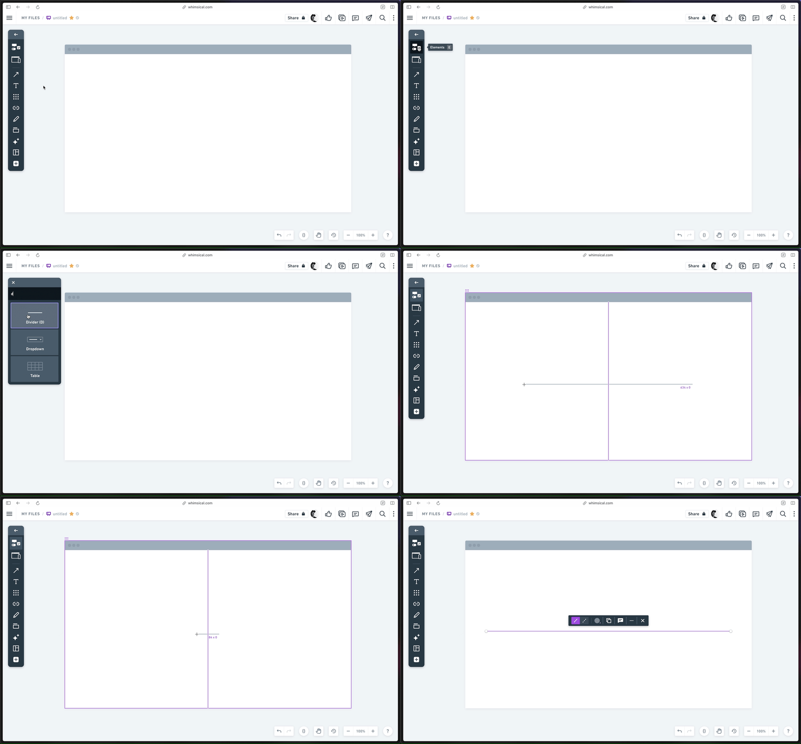
💡Pro tip: hold ⌘ on Mac or Control on Windows to have the divider expand to fit the container.
Button icons
Before AI was all the rage, a few customers were convinced we used AI in the product. How else could we know what icon you want when you open up the icon picker?
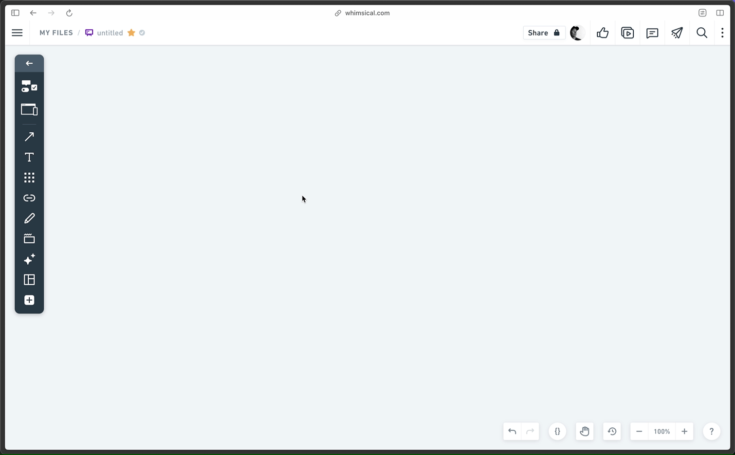
The truth is more sleight-of-hand than AI wizardry though. We pre-search the icon picker using the label in the button. Oftentimes, the icon you want is immediately at hand. If it’s not, the search query is pre-selected, so you can just start typing to find the one you want.
Responsive icons
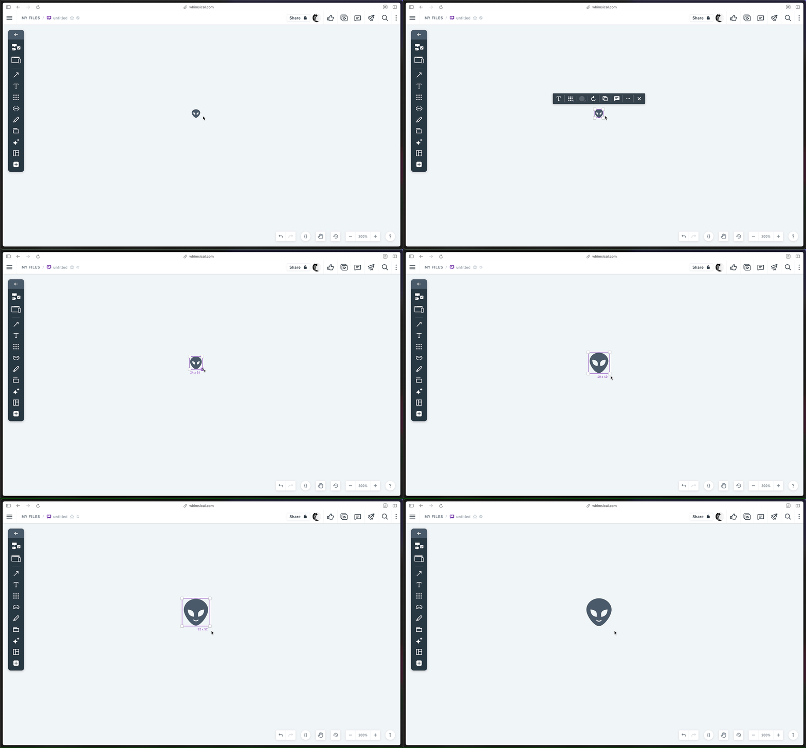
At small sizes, details in icons can be more confusing than helpful. Other tools ignore this nuance or give you multiple sizes to choose from. Neither are a great experience.
Instead, many of our icons are responsive. When scaled, we swap in alternates that look good for the size. The result is that your work looks great with no extra effort.
The truth is out there
Surrounding text
There are a lot of cases when you need to surround text with characters such as quotation marks, parentheses, or brackets. We make this easy: just select some text and press the opening character. We’ll add the matching character at the end.
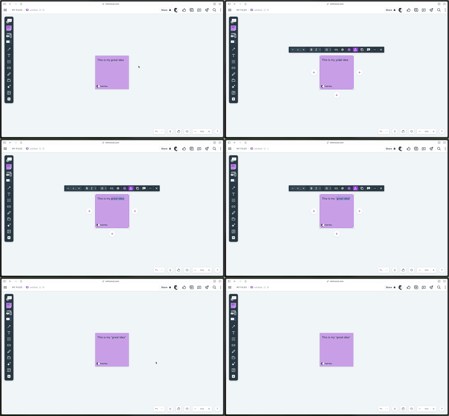
If you’re not used to this, it can take some getting used to. But trust me that once you’re hooked, you notice its absence everywhere. You’ve been warned 😭.
Sections
Sections are great ways to clean up your Boards, get organized, and spark some joy. But sometimes you forget to put them on the canvas before you start working. No worry: just select some objects and choose 'Wrap in section'. Presto!
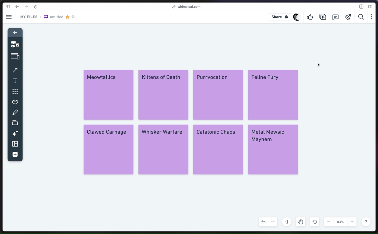
On the flip side, when deleting a section, we take care not to delete the content within. But what if you want to delete that too? We gotchu. All the content is automatically selected, so it can be immediately moved or deleted if you like.
Table rows & columns
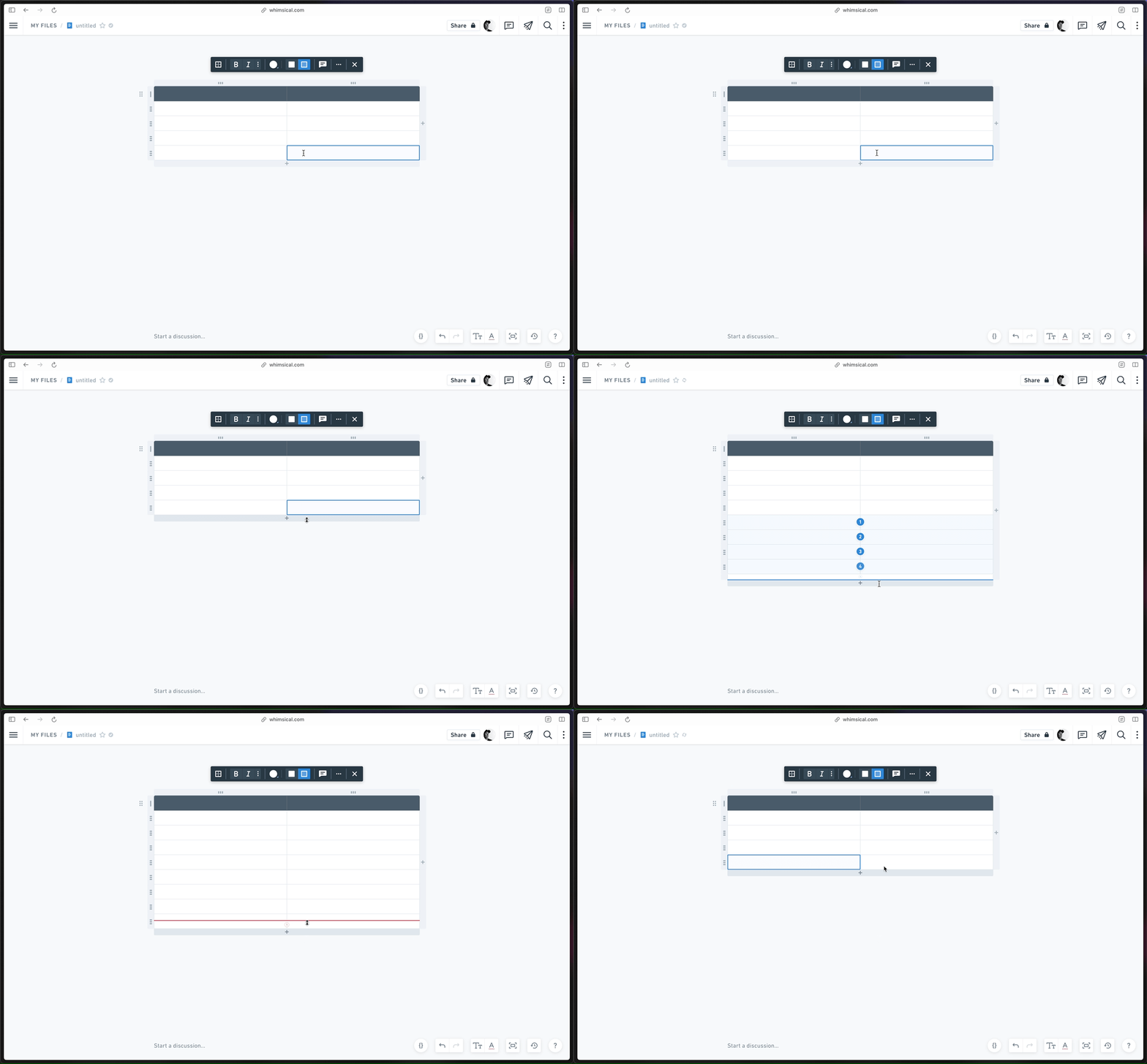
Changing a table matrix can feel tedious. Sooo many clicks on little buttons — who has time for that? Not us. If you drag the + button in the ribbon, you can add a specific number of rows in one gesture. Naturally, dragging also works in between rows and columns — and in reverse. 😎
Template Tips
Templates give you the materials to get started quickly. Often, they also contain instructions and examples.
But there’s a tension here: these helpful tips become noise when you’re ready to use a template. Going through and manually deleting this content is toil. We don’t like toil. Thankfully, it’s easy to get rid of this content and get down to business. Just click “Remove tips” to delete the examples and instructions.
Check out all of our templates here.
These are just a few examples of small details that add up, and there are many more that we didn’t include. If you’re a Whimsical user, keep your eyes peeled for decisions you didn’t need to make. If you’ve never used Whimsical before, try us out for free. We hope you’ll be delighted. 💜

