Goodpatch partners with dozens of companies around the world to build digital products. They provide a wide spectrum of services that range from high-level strategy all the way through to development. As a design firm, they use tools like Figma, Sketch, and Zeplin for high-fidelity design work and Keynote for presentations, pitches, and all forms of internal and external communication. Over time they've noticed a few bottlenecks in their process:
- Keynote is single-player and that makes collaboration difficult (Note: Keynote has since added collaboration features.)
- Sharing files can be messy and inefficient
- In addition to design work, other work-in-progress files and wireframes need to be shared throughout different project phases
In Search of a More Collaborative Tool
In order to work together more effectively, they needed to make some changes. They had to find a tool which was first and foremost collaborative. It had to be powerful enough to communicate effectively without sacrificing aesthetics. And it had to be easy enough that the whole team could use it, not just designers. This is when UX Designer and Researcher, Diana Albu, found Whimsical and shared it with the rest of the team. The particular task at hand was to collaboratively design a user journey for a client. Whimsical allowed them to work on this together with ease—both the creation process internally within their design team and also collaboration with the client team.

One of the great things about Whimsical is that anyone can use it. Whimsical breaks down barriers between designers and non-designers by getting everyone collaborating in the same tool.
Monica Ray Scott Design Strategist
What initially started as a single use case for a client has turned into a tool that Goodpatch uses for a variety of activities, including:
- Project Planning
- Wireframes
- Product Architecture
- Brainstorming
- Tracking OKRs
An Improved Workflow
Since adopting Whimsical, Goodpatch has enjoyed a more streamlined workflow and easier communication within their teams. "A big advantage of Whimsical is better alignment across teams and disciplines," explains Monica Ray Scott, a design strategist at Goodpatch. "It means that two people can talk about something, map it out, and share it with a third person that wasn't in their conversation."
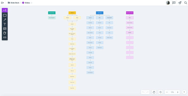
Goodpatch still uses all of their design tools and Keynote. The key is to use each tool for the right job. For example, they plan out their slide arrangement ahead of time in Whimsical before working on any of the slide layouts or visuals. They produce certain charts, such as user journeys, in Whimsical and then pull them into Keynote. And most importantly, they are now able to seamlessly collaborate as a whole team.

Planning out Keynote slide structure in a Whimsical Flowchart