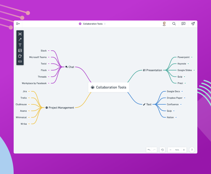
Contextual toolbars deep dive
A detailed breakdown of the toolbars inside of Whimsical.

Contextual toolbars are a fundamental element in Whimsical. We recently wrote a bit about why they are great for speed. In this post, we’re going to take a deep dive look at how we went about putting together the toolbars in Whimsical.
Goals
Whimsical is the visual workspace for teams where you can collaborate in real-time on everything visual – diagrams, wireframes, sticky notes, and more. Our desire is for the tool to be so fast that it literally gets out of the way, letting content and ideas flow onto the screen quicker than ever before. A big part of actually achieving this is making sure our toolbars and controls are thoughtful, consistent, and therefore extremely intuitive. Given that, here are a few of the things we thought about as we designed the contextual toolbars in our app.
Starting with Text
Text is a fundamental building block inside Whimsical. In fact, it’s found in the toolbars of all the other objects. The controls here should look pretty familiar. We kept things standard except we went with t-shirt sizes for the text so the user doesn’t get caught up thinking about specific font sizes.

Types of Controls
When you zoom in and examine the controls themselves, you’ll see there are a few different types:
- On/Off
- Visible Multi-select
- Popup Multi-select
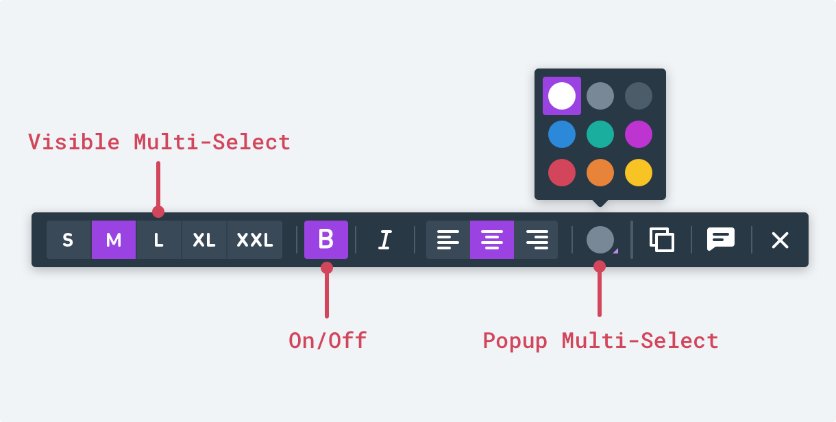
We try to limit the number of popup multi-selects because they require an extra click. In general, we’ve found them to be needed when there are more than four or five options. We stretched this for text sizes because we felt it was important to have instant access to them.
Categories of Controls
When we take a step back and categorize these controls, we’re basically working with object-specific controls and global controls.
- Object (text): size, style, alignment, color
- Global: duplicate object, add comment, deselect object

Shapes
Ramping up the complexity a bit, here’s what the shape toolbar looks like. We have the same Object and Global controls but now we also have the collapsed text controls on the left.
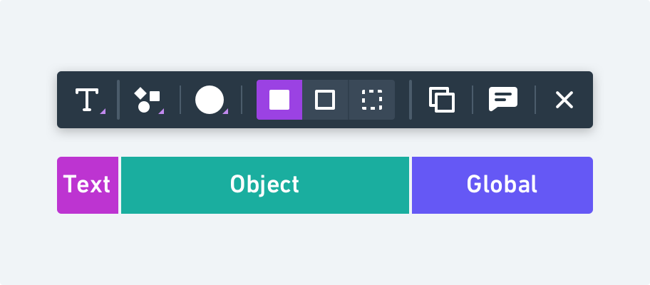
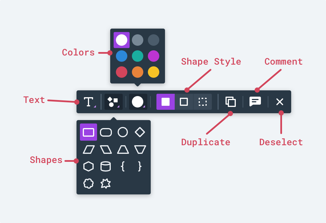
Here’s the detailed breakdown of each element. In this case, there are two popup multi-selects – one for color and the other for shape.
To access the text controls, you can press Enter on the keyboard or just click on the “T” icon.
Essentially, we’ve inserted the entire text toolbar one level deeper inside of the other toolbars. You can jump into it and then pop back out by hitting Escape or by clicking the back arrow.
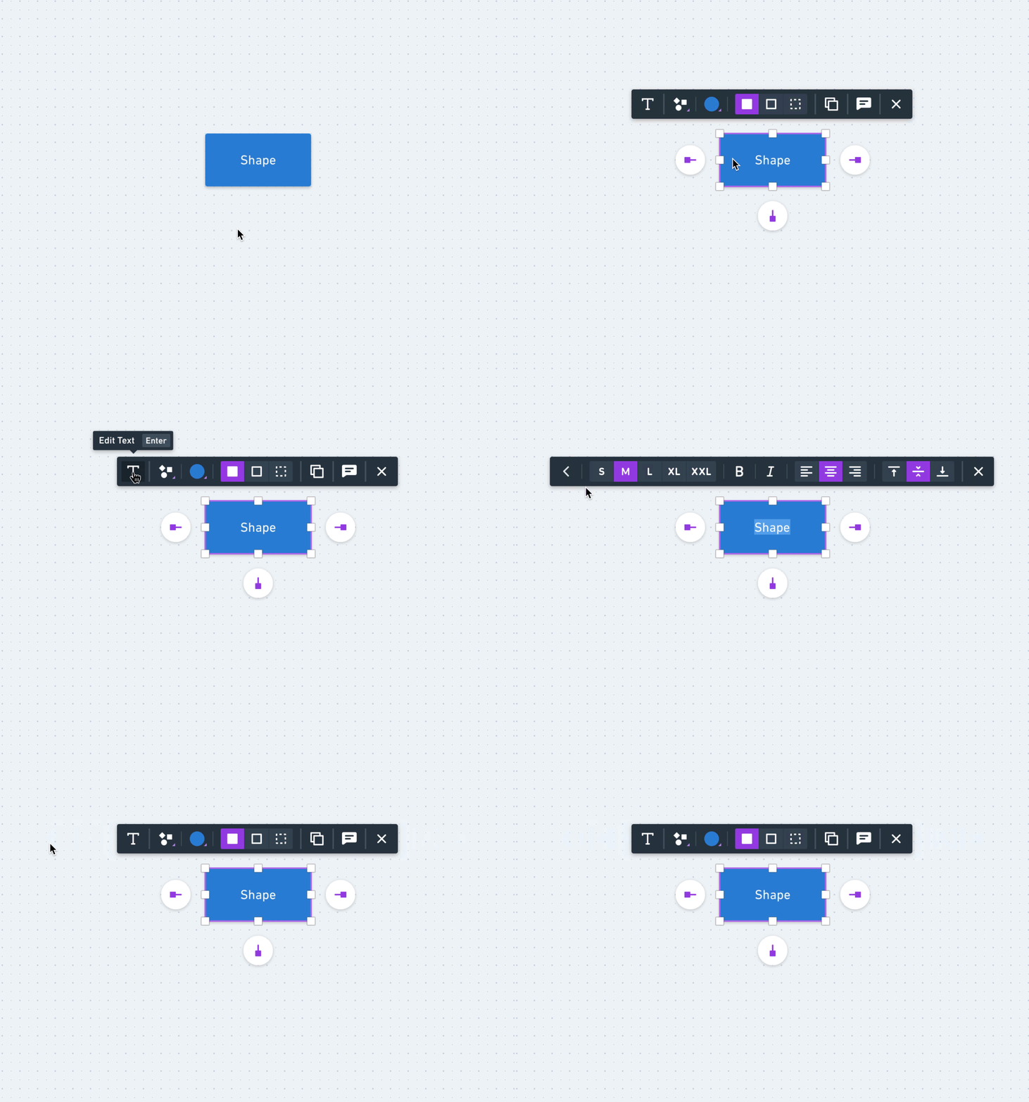
The benefit of this is that we’re able to condense the toolbar, let the object-specific controls have more emphasis, and still provide access to all the needed controls.
Extending the Pattern to Other Toolbars
Now that I’ve run through the basic mechanics, it’s interesting to see how this pattern maps to a totally different object. Let’s take a look at the icon toolbar.
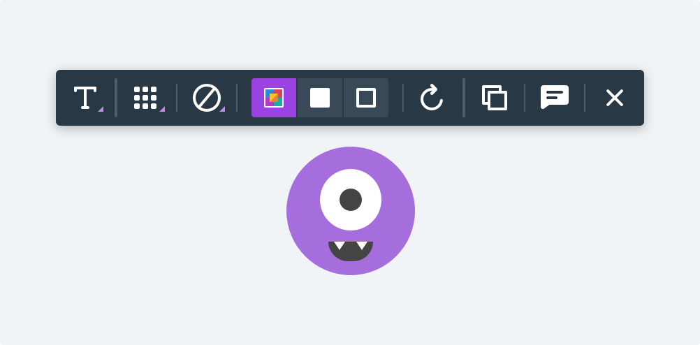
Looks a bit different, right? But we’re really just following the same pattern as we did with the shapes. Check out the comparison:
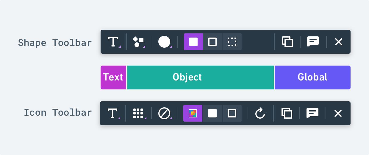
Same high-level categories. Same access to the text tool. Just a few different object controls in the mix.
Small Design Details
As we were going about the design of these toolbars, we leaned on a few subtle details to help with the visual groupings. The first is that we put a faint container around the visible multi-selects. This helps to distinguish them as a unit and keep them from blending into the neighboring icons.
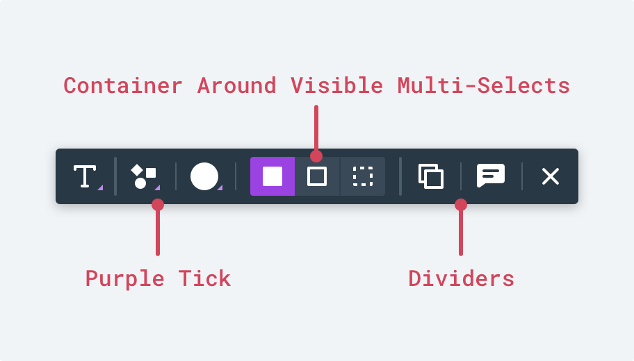
Another small decision was to use two different sizes of divider lines. We use larger dividers to separate the categories and smaller ones to separate items within the same category.
We also wanted a way to show which icons had additional menus associated with them and for this we included the small purple tick in the bottom right.

The Whole Picture
All in all, there are seven unique contextual toolbars used in Whimsical Diagrams. Each is tailored to the particular object they belong to but all of them follow the same general pattern. And patterns are good. After all, there are more than fifteen additional toolbars that will be introduced soon when we launch Whimsical Wireframes. If you think contextual toolbars are handy for diagrams, just wait until you see them applied to wireframes 😉

