How we designed Whimsical for speed
Because nobody has time for slow software.
Steve Jobs famously called the computer the “bicycle for our minds” – that is, a multiplier of speed and efficiency. Some apps these days, though, feel like going up a big hill on a beach cruiser.
Many times it can be felt as soon as you open the app for the first time. It’s confusing. The app just doesn’t do what you expect it to. It’s overwhelming. Things feel cluttered and it’s hard to find what you’re looking for. It’s siloed. You can’t collaborate in real time so you need to add additional steps to the process. In short, it’s frustrating and slow.
We designed Whimsical to be blazing fast so that visual collaboration can happen as efficiently as possible. Whimsical is the visual workspace for teams – flowcharts, diagrams, wireframes, mind maps, all sorts of visual work.
Here are a few choices we made to maximize speed.
Contextual Toolbars
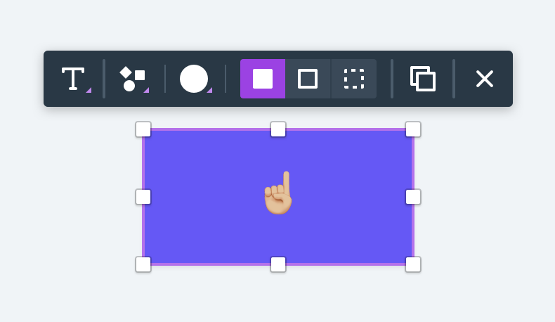
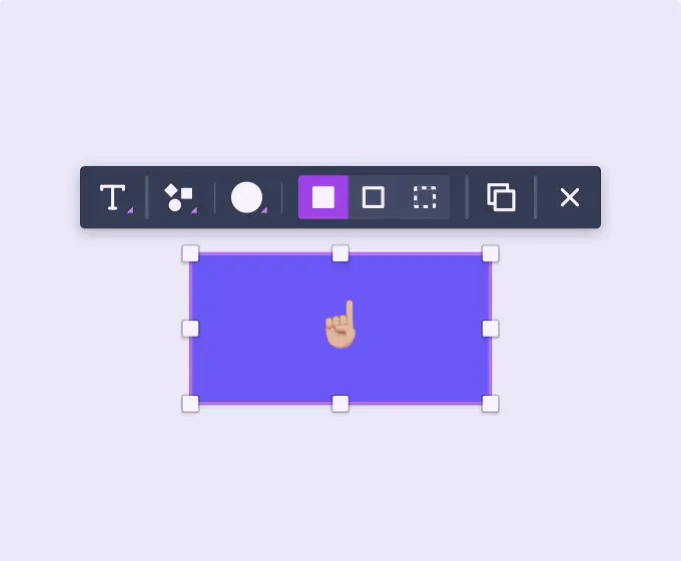
What I mean by a “contextual toolbar” is simply a toolbar that appears right next to the object you’re working on. So, for instance, the contextual toolbar for shapes in Whimsical looks like what you see above.
The Benefits of Contextual Toolbars
1. Less screen clutter. It’s become a fairly standard practice in app design to load up two or three edges of the screen with toolbars full of icons. Our main toolbar only has 6 icons in it. Here’s a visual comparison showing the number of clickable items in the main working screen of a few apps:
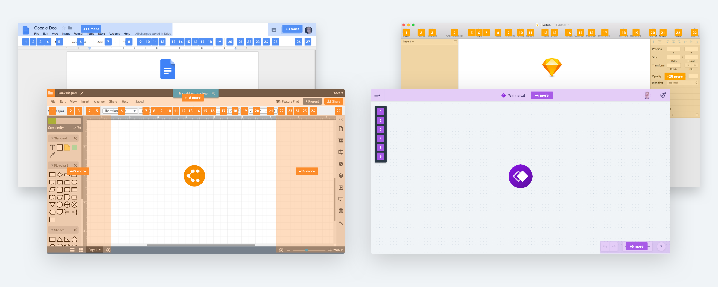
- Google Docs: 27 clickable items in the main toolbar and 45 total on the screen
- Lucidchart: 27 clickable items in the main toolbar and 105(!) total on the screen
- Sketch: 23 clickable items in the main toolbar and 53 total on the screen
- Whimsical: 6 clickable items in the main toolbar and 16 total on the screen
The reason we can get away with so few icons is that each of our objects has a contextual toolbar that houses all of its controls.
2. You only see relevant controls. Each toolbar is tailored to the object you’re working on and therefore, cognitive overhead is significantly reduced. You don’t have to learn which icons are available and which are disabled for each particular scenario. This is exactly what happens in traditional big-toolbar apps. Most icons are visible the entire time but depending on what you have selected, certain icons that aren’t relevant will be disabled. So in each new scenario, you need to spend the time processing which actions are actually available. This is not helpful if you’re trying to move fast.
3. The actions are closer to where you’re working. Not only are you just seeing relevant controls, you also don’t need to move your mouse across the entire screen to reach them. Have you noticed how much inefficiency of motion there is when you place toolbars along the far edges of the screen? Closer actions mean you can spend less time traversing the screen and more time on your content.

4. Onboarding for new users is more gradual and less intimidating. Contextual toolbars allow the user to be more gradually introduced to the controls. You can start with just a few primary objects. As you add each one, you start to see what’s available for each. Since the options are tailored to the object, they only require a small amount of mental processing to understand. In contrast, think about someone opening up Sketch (or even worse, Photoshop) for the first time. You are greeted by an abundance of icons that you then need to digest and decipher what each one does. Some create new objects, some manipulate existing objects, some aren’t applicable until you do other actions first. It’s more complicated and it’s both harder and slower to get started.
Less Choice
Another decision we made to increase speed was to limit the number of choices available. This both enables and enhances the benefits of the contextual toolbars.
You only get a few basic objects to work with.
You get just enough colors and styles for objects, which is really not many.
Text styles are similarly scoped down. You can choose between t-shirt sizes. You don’t need to think about whether you’re using font size 34 or 36. It has what you need but not more.

Optimization for Common Actions
Flowcharts and diagrams have a few common actions that are repeated over and over. Optimizing for them means significant gains in speed.
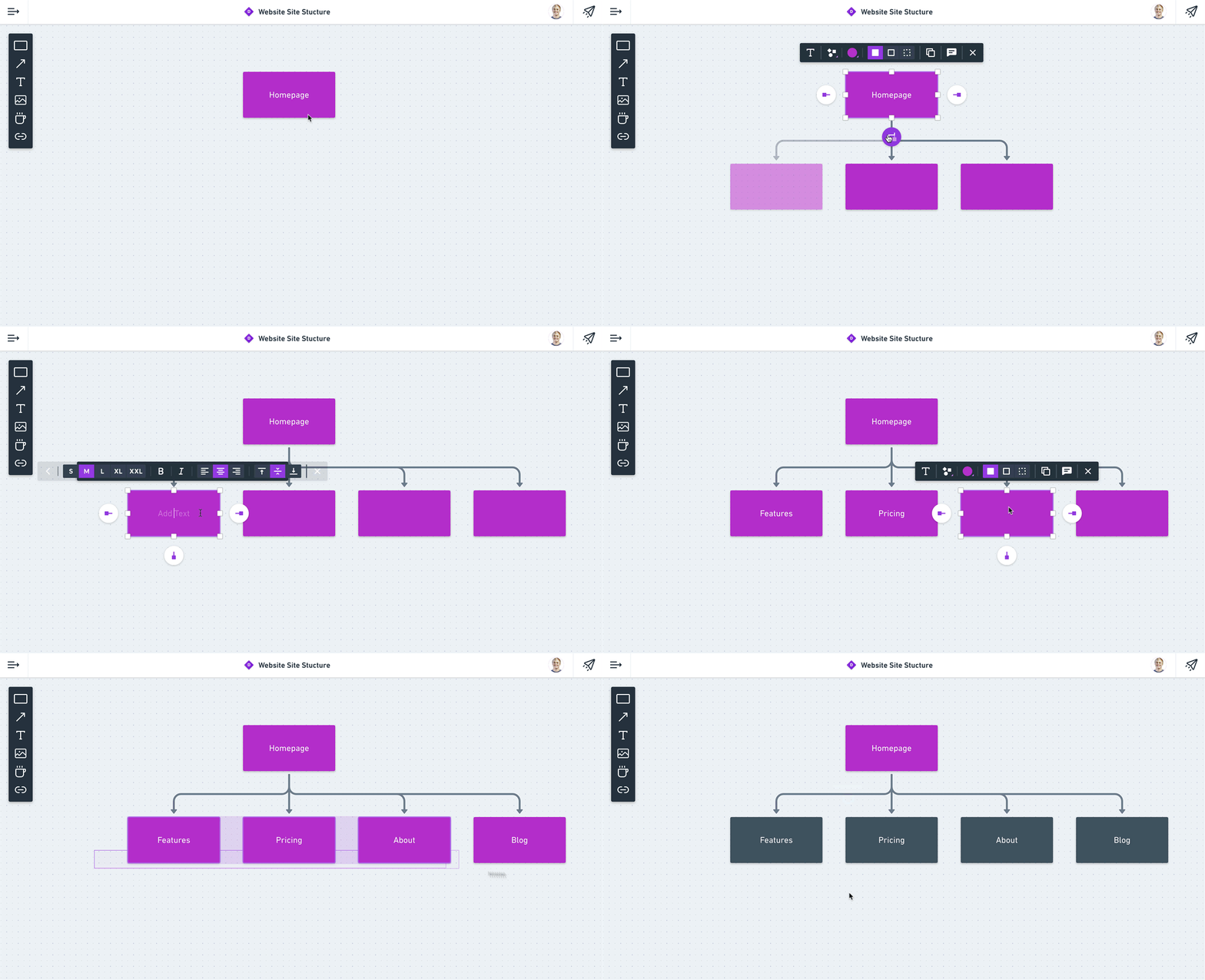
Quick and efficient connecting of objects. This is the bread and butter of flowcharts and sitemap diagrams. You need to connect objects, often in a hierarchical structure. For these use cases, we added “Quick Add” buttons around each object, allowing you to connect objects with remarkable speed.
Easy access to a robust set of icons. It’s quite common in diagrams to add icons in order to communicate more effectively or to spruce up the visuals. It’s nice to have consistency and also not have to take the time to create them yourself. This is why we added thousands of vector icons to Whimsical that are literally a click away. Not only are there a ton of them, they are all searchable, infinitely scalable, and they can be styled however you want. You can change the color. And you can also change the style between solid, outline, and full color.
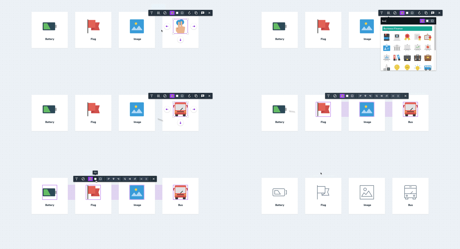
Another sweet feature about these icons is that they are responsive. At small sizes, they are streamlined and simple. As you scale them up, they automatically add more detail and nuance.

Output Looks Good Without Extra Work
One final thing that we did to increase speed in Whimsical is that we tried to make the end result look like it had been designed custom in Sketch. We did this by removing all constraints and literally designing the full diagram first in Sketch. Then we figured out how we could achieve this look in our app. Many of these details are subtle – the shapes have slighted rounded corners, as do the connectors. We added a slight drop shadow to the solid shapes. We selected a versatile, workhorse font. The hope with all of this is that the focus can be on ideas and not all of the extraneous details that go into “designing” a diagram.
One Last Word
Please note, I’m not saying that every app should have contextual toolbars and limit styling options. These were intentional tradeoffs we made because we were optimizing for speed. We believe they were right for our app. You should thoughtfully consider what is right for yours. For example, an app that is created for highly specific work may require a broader, more robust set of options. High-fidelity design apps like Sketch may be better off with quite a few more controls. But you should also be careful not to justify unnecessary complexity in your app. If you’re used to the way Google Docs sets up their interface, you might assume that’s as simple as it gets. That is, until you use Dropbox Paper with its superb simplicity (and use of contextual toolbars!). Then you realize that things could have been a little faster and easier to use all along.
Our goal with Whimsical is to enable ideas and content to flow onto the screen faster than ever before so that you can collaborate visually with your teammates.

